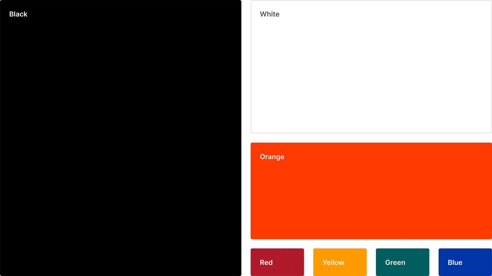
Bold and direct, with a nod to the industry we serve.
At Procore we have built our brand around elements that lean into the visual language of the construction industry where color is used to bring visual clarity to jobsites that are often chaotic and busy. Likewise, in a media world saturated with messages and brands, our bold, simple, and direct, colors help us stand out and be seen.
Color is a differentiator for our brand and helps us create consistent experiences. We are committed to complying with AA standard contrast ratios. To do this, we chose primary and secondary color palettes that support usability, which ensures sufficient color contrast between elements so that users with low vision can see and use our products.
Primary Colors
Our primary brand colors originate from the Procore logo: Procore Black, Procore Orange, and white. They are used to provide consistency, accessibility, and a powerful simplicity throughout all brand communications. Black is our most-used primary color, and orange is used for accent, as well as any calls to action.
Procore Black
A no-nonsense color that is equally powerful and elemental, Procore Black is our leading primary color, and its various shades are used for text and background colors.
Procore Black
HEX
000000
RGB
0 0 0
CMYK
60 40 40 100
HEX
Black 6 C
Procore Orange
Procore Orange is vibrant, full of energy, and a nod to the signage color you'll find on many construction sites. It's mainly used in buttons, text links, and as a leading accent color in icons and illustrations.
Procore Orange
HEX
FF5200
RGB
255 82 0
CMYK
0 82 100 0
PMS
Orange 021 C
Grey
HEX
181818
RGB
24 24 24
CMYK
73 67 65 79
PMS
N/A
HEX
282828
RGB
40 40 40
CMYK
71 65 64 68
PMS
426 C
HEX
555555
RGB
85 85 85
CMYK
64 56 55 31
PMS
N/A
HEX
63656A
RGB
99 101 106
CMYK
62 53 47 19
PMS
Cool Gray 10 C
HEX
898B8E
RGB
137 139 142
CMYK
49 40 38 3
PMS
Cool Gray 8 C
HEX
9FA2A3
RGB
159 162 163
CMYK
40 31 32 1
PMS
422 C
HEX
A3A4A6
RGB
163 164 166
CMYK
38 31 30 1
PMS
N/A
HEX
C2C6C9
RGB
194 198 201
CMYK
24 17 16 0
PMS
428 C
HEX
E3E4E6
RGB
227 228 230
CMYK
10 7 6 0
PMS
N/A
HEX
F4F5F6
RGB
244 245 246
CMYK
3 2 2 0
PMS
N/A
HEX
FFFFFF
RGB
255 255 255
CMYK
0 0 0 0
PMS
White
Color Usage Proportions
Procore Black is our predominant brand color, with white and shades of black supporting it. Procore Orange is used for accent, and as a call-to-action.
Our secondary color palette is used to bring illustrations, infographics, iconography, and presentations to life. They should always be used with primary colors, never taking the main stage on their own.

Secondary Brand Colors
Our secondary color palette is primarily used to round out illustrations and icons with a wider palette that complements our primary brand colors, and allows us to tell a more human and visually engaging story. It also gives our brand some flexibility on occasions where we need a wider palette than our primary colors, but keeps our overall usage of colors consistent. Each color has highlight and lowlight shades for depth.
Red
Brick
HEX
A12B2F
RGB
161 43 47
CMYK
25 95 85 19
PMS
704 C
HEX
802629
RGB
128 38 41
CMYK
31 92 81 36
PMS
1815 C
HEX
BD3C4B
RGB
128 38 41
CMYK
31 92 81 36
PMS
1815 C
Orange
Cone
HEX
FF6C00
RGB
255 108 0
CMYK
0 71 100 0
PMS
1505 C
HEX
E14504
RGB
225 69 4
CMYK
7 87 100 1
PMS
1665 C
HEX
FF6D37
RGB
255 109 55
CMYK
0 71 82 0
PMS
1645 C
Yellow
Crane
HEX
FF9F19
RGB
255 159 25
CMYK
0 45 96 0
PMS
1375 C
HEX
ED7800
RGB
237 120 0
CMYK
4 64 100 0
PMS
716 C
HEX
FFB648
RGB
255 182 72
CMYK
0 33 79 0
PMS
1365 C
Green
Viridian
HEX
005C5E
RGB
0 92 94
CMYK
97 44 57 27
PMS
7721 C
HEX
004C46
RGB
0 76 70
CMYK
95 46 67 42
PMS
3302 C
HEX
007574
RGB
0 117 116
CMYK
100 32 56 13
PMS
7718 C
Blue
Tarp
HEX
0033A1
RGB
0 51 161
CMYK
100 84 11 3
PMS
286 C
HEX
002F6D
RGB
0 47 109
CMYK
100 86 29 23
PMS
294 C
HEX
435CC8
RGB
67 92 200
CMYK
79 69 0 0
PMS
2726 C